What color is THAT?
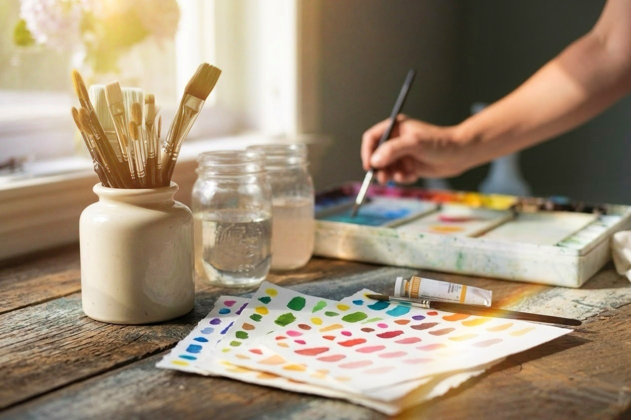
Have you ever been paralyzed by your paints?
Not knowing what colours to mix can be a non-starter for a painting you've been longing to tackle. You may stare at your palette, completely overwhelmed... so what do you do?
Perhaps you're stuck in some old and basic habits that keep your artwork looking amateur and you are finally ready to get to the next level.
OR WORSE...
You just don't start at all.
That paralysis comes from the overwhelm and confusion. After all, brown in not just Burnt Umber straight out of the tube...

"Heart of Gold" watercolour by Crystal Beshara
There are nuances that can elevate your painting: choosing to integrate reds, violets or even charcoal hues could really bring your painting to life and help you move beyond a basic palette.
But....
- Which paints?
- In what context?
- Why does my painting always looks cartoonish?
- How do I avoid "MUD"?
It is one of the most universal hurdles in painting in any medium, be it watercolour, oil or acrylic. Whether you are trying to capture the subtle warm undertone in animal fur, the luminosity of a sunlit shoreline, the shifting greens of a summer landscape, or the moody violet-greys rolling through a dramatic storm sky... colour can feel like a guessing game.
Most artists end up with one of two extremes:
The Tube Trap: Buying every single convenience tube on the shelf, hoping one of them is the exact shade of " wet sand."
The Mud Wheel: Over-mixing three or four pigments directly on the palette until the brilliance collapses into dull and lifeless result.
The secret isn’t owning 60 tubes of paint. It’s understanding the precise pigment partnerships that keep mixtures clean, luminous, and predictable. You can train your eye through years of practice and isolating colours using a viewfinder and experimenting on your own...OR you can short cut with pre-made recipe cards like these (below).
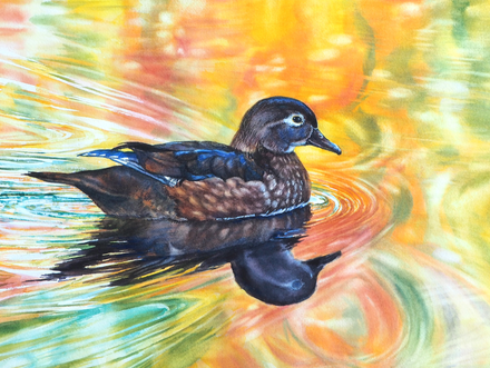
"A colourful Masquerade" watercolour by Crystal Beshara
YOU ONLY NEED 14 core tubes. 35 distinct formulas.
= Infinite variations!
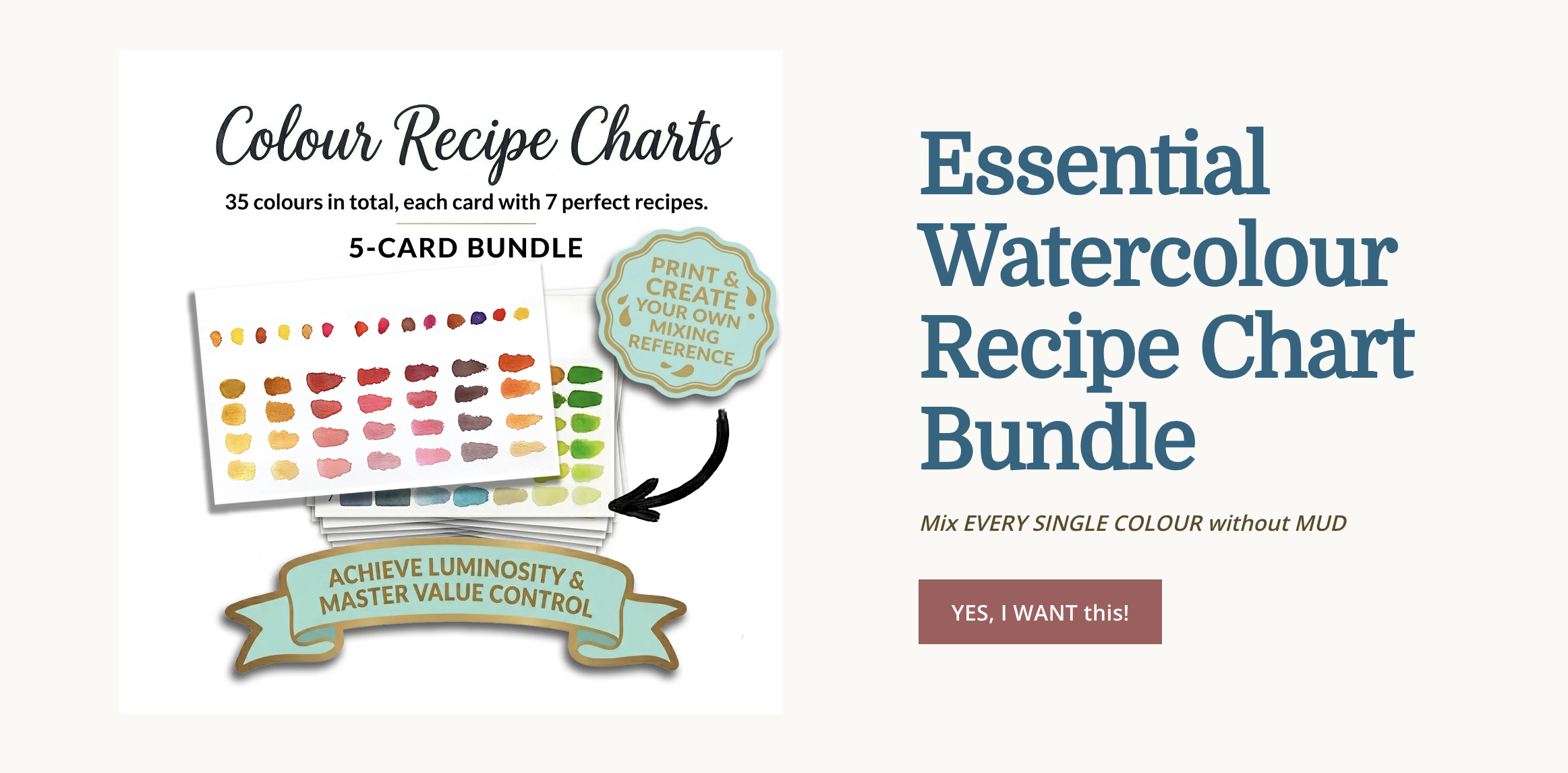
Stop Guessing, Start Mixing!
For over 25 years of pleinaire sketching and studio work I documented the exact pigment ratios and palettes I return to repeatedly. I turned those EASY to use formulas into a curated library of visual recipes:
👉 Explore the Colour Recipe Charts (Digital Download)
Instead of abstract colour wheels & theory diagrams, these charts function like a visual cookbook for your palette:
The Santa Fe: Clean neutrals, earthy undertones, and warm/cool shadow values that bring lifelike depth without looking flat. Perfect for Animals & Natural Textures and Landscapes.
The Caribbean: Luminous aquas, coastal teals and soft shoreline sands mixed cleanly without chalkiness. Think beaches & water but also skies, ice and snow.
Emerald Isle: Believable greens—from fresh spring growth to deep forest shadows - bypassing unnatural, garish greens straight from the tube. Great for Landscapes & Foliage
Dramatic Skies & Atmospheric Depth: Luminous cloud highlights, moody violet storm transitions, and atmospheric horizon gradients that keep their glow.
Hidalgo: Juicy, saturated high-chroma mixtures for florals & gardens!
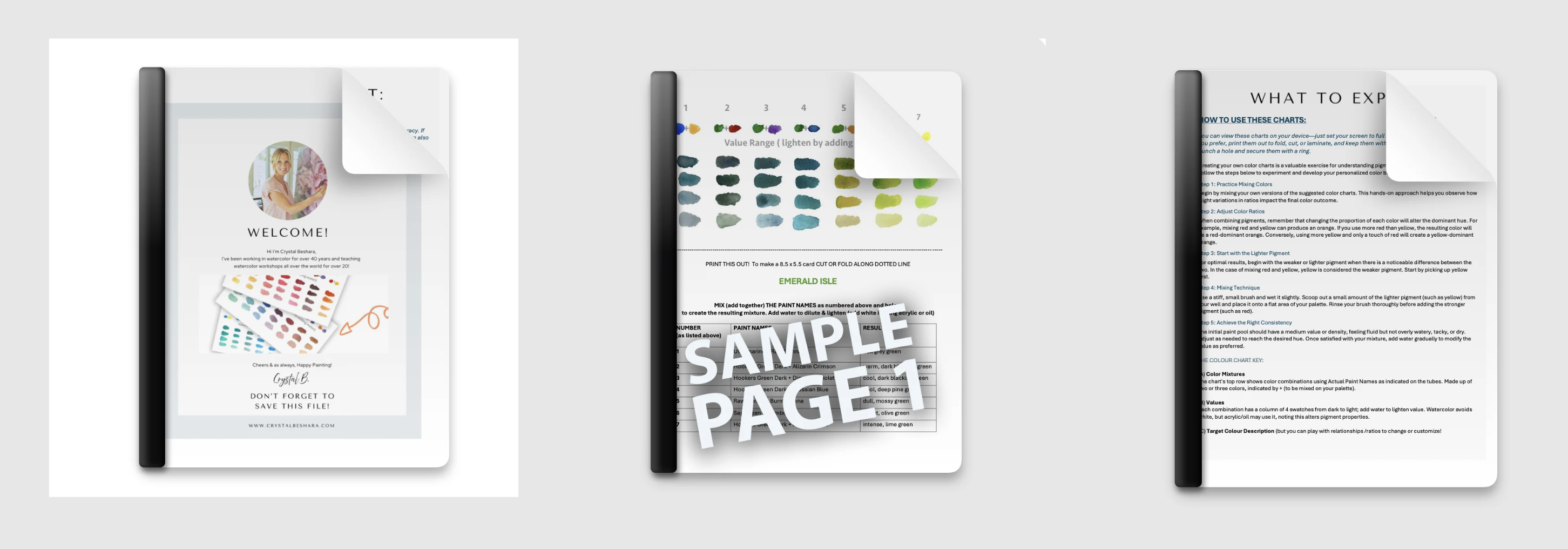
YOU GET ALL 5 for 29.99 (an instant download)
Designed for Immediate Studio Use
Because these are instant digital downloads, you can put them to work immediately:
View on your tablet: Keep them open on an iPad or backlit screen beside your easel for true-to-life value and chroma comparison while you paint.
Print & laminate: Print them at home or your local print shop to keep a tactile, wipe-clean reference right next to your mixing well.
Cross-medium versatility: While designed with watercolorists in mind, the underlying pigment dynamics, colour harmonies, and value scales translate seamlessly to oils and gouache as well.
If you are ready to take the hesitation out of your palette and mix with intention every time you sit down to paint, you can grab your set today:
👉 Download Your Colour Recipe Charts Here
Happy painting, and here’s to clean, glowing palettes!